How to Tell If Your E-Commerce Website Is Outdated and What to Do About It
Did you launch your online shop years ago and never got to upgrading its design? Are you using one of the showy standard website templates? Are you resistant to following the latest trends and using “gimmicks”?
If the answer to any of these questions is “yes”, this article is for you. We sincerely hope that your e-commerce business is successful in spite all of that, but just in case it isn’t, reading this post should help.
You see, the field of web design changes and evolves fast. Remember how Wikipedia’s Home page used to look like a decade ago?
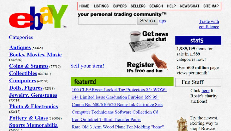
And just you remember, ICQ used to be the ultimate messenger app and online chatrooms were a thing.
Only ten years have passed, but those things seem like dinosaurs to any Internet user of today. The changes in e-commerce trends are just as drastic, so you should review your website right now to see if it’s outdated. And if it is, we offer some ideas on how to fix the issues and improve your shop fast.
1. Your Design Is Gaudy
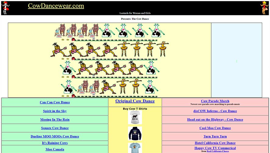
There used to be a time when bold, showy, and multi-colored designs with a pinch of glitter on top were all the rage. The Internet was bland in those days and the aforementioned colorfulness was a way to stand out and not a gaudy sign of having no sense of style that it is today.
If you want a website to sell now, you need to make sure its design doesn’t distract the customers from ogling the products they want. This means it needs to be elegant, minimalistic, and muted. Little text, few pointed visuals, and lots of white space is the best formula for a stylish e-commerce website today.
How to Fix It:
- Hire a web designer or at least have your website audited by a professional who will be able to point out the areas that need to be changed ASAP.
- Choose the minimalistic design.
- Remove any background images from your website (if you have any).
- Replace any elaborate fonts with something easy to read.
- Add infographics, they are one of the most popular types of content today and any designer can create one for you.
2. Your Template Is Outdated
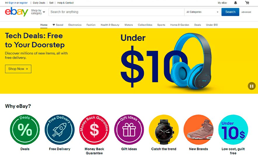
Many website builders offer a variety of templates, some of which have been in the library for years. As web design is a rapidly evolving field, using one of these old templates will only make your website look outdated.
Bear in mind that using templates is great and the InSales platform itself offers them. The point is to use top-of-the-line templates that account for all latest design trends.
How to Fix It:
Check out our template collection first. You can easily use any of them to update your website design and we’ll be happy to help you do this.
3. You Are Using Sensationalistic Headers
“SUPERMODELS USE THIS SECRET FACE MASK TO LOOK YOUNG!!!” Is it sensationalist or old plain stupid? The consumers of today are far too intelligent and good at fact-checking to fall for yellow-press-style headlines like this. Any e-commerce website using them is more likely to be perceived as spam than to actually attract customers.
How to Fix It:
Review and rewrite all your content if necessary. It’s imperative to only leave the content of value. If there is some important information hidden in your sensationalist announcements, present it in a proper form.

4. Your Content Is Overstuffed with Keywords
Are you still creating keyword-stuffed posts for search engines’ bots to notice your website? Are your SEO experts saying that it’s the right thing to do?
Fire those “experts” and stop at once!
Search engine protocols have evolved greatly since the time when you could cheat the bots with multiple keyword repetitions. And yet many e-commerce websites still feature product descriptions that have a list of poorly tied together clunky keywords. And it’s not the copywriter’s fault that it all looks unnatural because there is no way to put a dozen phrases like “smartphone cheap buy” into a text and make it sound natural.
Today search engines rank content based on its value and having too many keywords can work against you. Therefore, you must think of the customers first when you create any content. Ask yourself “what kind of value will this information offer to a consumer?”
How to Fix It:
Again, you should review and rewrite all your content to make sure it fits the latest SEO requirements. As your Home and Product pages have the best chance of getting ranked high by search engines, you should start your upgrades with them.
5. Your Website Is Hard to Navigate
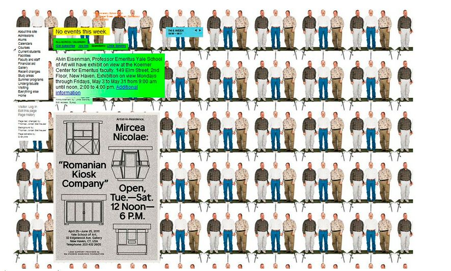
How much time and how many clicks does it take a person to find something they need on your website? If it’s more than a few seconds, your website is outdated and needs an upgrade ASAP. No one will waste minutes trying to find a product in an online shop. They will simply leave and buy it from a better website.
The worst thing is that search engine algorithms today take into account the time visitors spend on the website. So, if they open yours only to get confused and close the tab after a few seconds of futile efforts in finding the product category they need, your ranking will be low.
How to Fix It:
Make your layout well-organized and easy to navigate and add a map to help visitors understand your catalog and its categories. This will make people spend quality time browsing through your product pages. And don’t forget a great Search feature that has a variety of filters to help people find exactly what they need fast.
PHOTO
6. Your Website Isn’t or Is Poorly Mobile-Optimized
The number of people who browse the Web using their smartphones and other mobile devices is growing by the day. It has already exceeded the number of those who use desktop computers. Therefore, not having a mobile-optimized website is a grievous mistake.
And if your website has an adaptive design, which doesn’t work perfectly well for all devices, your situation is just as bad.
How to Fix It:
It’s imperative to invest in a website design that will adapt to any screen size seamlessly. The mobile version of your website must feature all the most important elements, such as the Cart, order forms, callback widgets, etc., and not only the Menu.
- Any text on your mobile website must be big and easily readable.
- Don’t make headers too big as they will take up all the screen and visitors might lose interest before they even scroll down to the product.
- The Callback, Menu, and Cart buttons must be visible, fixed, and easy to reach at all times.
Check out several adaptive website design templates developed by InSales:
PHOTO
7. You Don’t Have a Dedicated Mobile App
Many people today prefer using apps to looking something up on a website using mobile browsers. Therefore, having a dedicated app can offer a variety of benefits, including:
- Establishing an easy connection with the customer.
- Attracting attention using PUSH-notifications.
- Providing information about special offers and sales in real-time.
- Making it easier to find any product in your catalog.
- Simplifying the payment process as buyers will be able to use their mobile banking apps to pay.
A good app should also be able to create new orders, add new products, upload pictures, etc.
How to Fix It:
For all its advantages, you shouldn’t rush to develop a dedicated app for your e-commerce business. Not every store can benefit from them, so only do this if:
- Your online shop’s traffic exceeds 10,000 visitors a day. Any less and you won’t be able to get even on the costs of the app’s development.
- You have many customers who visit your website multiple times “just to check what’s new”. Even if they don’t buy, your business is constantly on their minds.
- Your repeat sales rate is very high.
All in all, remember that a good dedicated app can be very expensive to develop. Therefore, you need to be sure that it’s worth the investment before ordering one for your business.
8. You Don’t Have Callback Widgets
Do you offer a callback or at least an online chat consultation to your customers? If yes, you already know how much good these features can do for your conversion rate.
If not, you should fix this right away. It’s not imperative to hire real people to provide consultations. Even using a chatbot is preferable to not offering this service at all.
How to Fix It:
- Add a Callback widget right away, along with some other useful features, like an online calculator if you sell wallpaper or other products that require calculations to determine how many pieces the customer will need exactly. An online chat can also be extremely beneficial for your business.
PHOTO
9. Your Website Doesn’t Offer Personalized Suggestions
Offering personalized suggestions based on the product category the visitor is browsing now or has browsed previously is a great way to boost conversions as well as increase the time people spend on your website. Today you can use many solutions that will track the visitor’s actions on the site and generate suggestions based on that.
How to Fix It:
Install the solutions that can provide personalized suggestions. To achieve maximum impact, you should also use solutions that can generate personalized emails based on the customer’s activity.
PHOTO
10. Your Design Isn’t Customized for Your Brand
Any website template can be adjusted to become not only unique but also a good match for your brand. And you can always create a custom-designed website using the InSales platform. This way, it’ll meet all your needs perfectly.
The main advantages of doing this are:
- You will be able to create a unique and memorable website.
- Web designers will create a website that fits your corporate identity.
- The customer’s word is law. You provide us with the details of the website you want to have and we create it to match your specifications perfectly. We can also use our experience to offer tips and suggestions on how to improve your ideas to achieve the best results.
- All websites we create are mobile-optimized and we take into account all the latest web design trends during the development.
Contact us and we will analyze your niche, identify the most popular trends there, and find out what the most important features are for your specific e-commerce store. We will develop several variations of the design based on your requirements and budget. We guarantee to provide high value for your money!
PHOTO
What will you get?
- A unique website that will not only look good but also sell well.
- Top-grade layout.
- Integration with the InSales platform.
- Testing (we make sure that the design works and make adjustments if necessary).
- Guarantees outlined in the legal contract.
So, have you reviewed your website? We hope it’s great and that no one can call your e-commerce shop outdated. If not, you know what to do.
Best of luck in your sales!

No sales again and you are getting desperate? This article will tell you all about the possible reasons why this […]

The quality of your website is a major factor in determining your online store’s success. And usability, in turn, is […]

Today we will talk about how to design an online store for success. It’s not only about the aesthetic appeal, […]

E-commerce businesses have to use a variety of methods in order to win customers in the extremely competitive markets of […]

The number of customers you have determines the success of your business, socially in a highly-competitive industry like e-commerce. A […]
