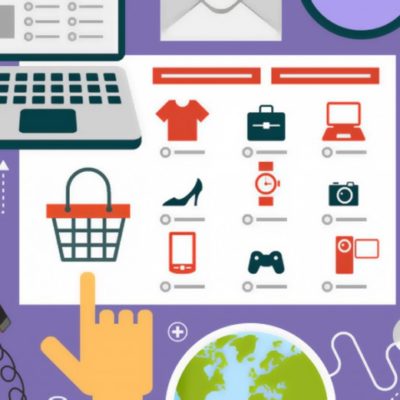
Understanding Usability: Common Mistakes, Fixes, and Tips
The quality of your website is a major factor in determining your online store’s success. And usability, in turn, is the most important factor that impacts the website’s quality. Therefore, it’s essential to priorities usability in your web design. If visitors coming to your website cannot make sense of it and easily navigate to the page they need within 30-40 seconds, they will leave. This means that attracting them with great ads and effective marketing isn’t enough if you can’t hold their attention for the time it takes to make a purchase.
In order to make sure that you do hold them on your website long enough you should:
- Prioritize usability during website design.
- Try to put yourself in your first-time visitor’s shoes.
- Take into account both successes and failures of your competitors.
Common Online Store Usability Mistakes and How to Avoid Them
1. No contact information
Some shops are so scarce with their contact info that they only have an email and a contact form on their websites. Obviously, a consumer seeing it will get suspicious because not offering detailed information about the business is a hallmark of frauds. With these things in mind, they will move on to a different shop that appears safer.
PHOTO
To provide your customers with a sense of security your Contact or About Us page must feature not only an email address but also:
- Physical address of your office or pickup points if you have any.
- Work hours for the aforementioned office or pickup points.
- Order storage duration & terms.
- Legal details (registration number, bank details, etc.)
- Phone numbers.
It’s best to have a free call center for the customers to contact. But if you can’t afford it yet, you must at least run an online chat where your managers will be able to provide assistance and respond to customer queries.
The important thing here is for your Contact page to show that you are a legal and transparent business that’s easy for customers to reach if they have any questions.
PHOTO
2. Mandatory registration
Now, imagine a situation where you see a product you want to buy at some random online shop you’ve never seen before. But you’re fired up and press the Checkout button only to be doused with a bucket of ice water otherwise called “register for checkout”.
And not only is there a registration form, which is one more unnecessary step between you and your dream purchase, but that form is also long and arduous. And you also need to look for it because the actual Registration button is tiny and located at some random spot on the page. Moreover, when you finally get to it, there are a dozen fields to fill out.
Will you actually go through with a purchase at such a place?
No, you won’t, and no sane person will, so if you want people to buy from your online shop, you must make the checkout process as simple as possible.
PHOTO
Remember, it’s an online store you are running, not a top-secret military base. If a visitor wants to make a purchase in a few clicks and share none of their personal details with you, they must have an opportunity to do so.
You should provide an opportunity to register and create an account to use various perks of being a loyal customer. These two types of handling orders must go side by side instead of opting for just one.
3. Too many fields
Think back to the hypothetical situation outlined above. Say, you decided to register, but now you are facing a form with a dozen fields that wants you to share every personal detail up to (and sometimes including) your social security number.
Looks fishy, right?
Frauds sometimes use these tactics to cheat people out of important personal details. And even if the business is honest, this kind of “overattentiveness” is annoying and unsettling. Never forget that people buy online to save time, money, and effort. They won’t appreciate spending 3-5 minutes only to fill out what is, in essence, an unnecessary form.
PHOTO
Your Registration form should request only the customer’s name, email, and phone number. In that order because no one wants to share their phone first.
If necessary, your staff can find out any other important details when they contact the customer to confirm their order. However, in the majority of cases, you only need an email to establish contact.
4. Glitchy registration and checkout forms
So, your customer is an interested and determined hero who filled out the registration or any other form you requested and still wants to make a purchase. But imagine they made some tiny mistake when they were filling out those forms. But the system didn’t alert them for it. Therefore, when they get to the end of the checkout process, they have to redo it all again.
This happens when your forms plugin doesn’t work well enough.
PHOTO
The worst possible mistake is when the customer receives a message that an order cannot be processed “please, try again later”. Of course, you’ll fix this malfunction fast, but your visitors don’t know that. They will leave and buy from your competitors.
It’s imperative to ensure all your forms run like clockwork. Check them regularly and make sure the validator system alerts are active.
5. No product description
Being a new online shop that strives to show off its vast catalog of great products is not an excuse for not adding product description for every single product the moment you launch your website.
PHOTO
Having several great product pictures is good and necessary, but a detailed product description is just as important because:
- Product description increases trustworthiness.
- You can stuff description with keywords, thus enhancing your SEO.
- Without knowing some product details people might decide not to buy.
- Descriptions can motivate into making a purchase.
Your product description must provide all necessary details so the customer gets answers to all their questions from it. Provide pictures or other visual elements to show off different characteristics, like colors, sizes, and materials.
PHOTO
6. No one-click checkout
Not having this simple feature loses you a lot of customers, especially if the majority of your shop’s revenue comes from single purchases. And aside from make it possible to buy one item in one single click, you also need to simplify the checkout process as much as possible to minimize the number of steps people must take to make a purchase. Skip on the calls, SMS message confirmations, etc.
Remember the most important rule, which is to Keep It Simple.
PHOTO
7. Outdated website design
Outdated website design does not only look unattractive but also reduces usability. For example, it might make it harder to make a purchase from a mobile device.
PHOTO
If you want to boost conversions and sales, you must have a contemporary, stylish, and easy-to-navigate website.
10 Ways to Boost Your Conversions
Now that you’ve fixed the big mistakes that hinder conversions by reducing usability, focus on improvements:
1. Ensure your Home page scrolling is good
PHOTO
Scrolling comes in many types and you should definitely check them out, but the most important thing to remember is that content matters most. It’s in your best interests to organize content in such a way that the customer won’t need to scroll all the way down to find what they need.
2. Show off your benefits
Make sure that every visitor coming to your website sees the benefits you offer (discounts, free shipping, etc.) and your USP right away. They need to know why they should choose this store.
PHOTO
3. Make your website easy to navigate
It must be easy for your customers to make a purchase so every step of the checkout process must be obvious and connected with obvious cues, like a Next Step button.
4. Provide payment and shipping details
You should provide a variety of shipping and payment options to make it easy for any customer to get what they need.
It’s also imperative to provide details of the shipping options and estimated delivery times (be accurate!). If there are any limits to your shipping, for example, you only deliver within one region, you must mention it on every relevant page.
PHOTO
5. Help customers double-check what they bought
Give your customers a chance to see the products they checked in in the cart before finalizing the purchase. This will help them check their order and make sure they got exactly what they need.
6. Sort products wisely
Position your products wisely so that prospective customers don’t get lost and confused browsing dozens of options. Add “sort by price” and “sort by popularity” features as well as a variety of more detailed filters for your Search plugin.
PHOTO
7. Remove any “no”
There is no place for negativity on your website. It will be best to remove any “no” from your content so the customers don’t think they are denied something. For example, instead of “no items found” your Search should offer a list of similar products.
It’s also essential to remove any limits, like minimum order amount or number of items per order. Offer choices if you have to, for example, state the shipping cost (a high one) for orders under $10.
8. List contact information where it’s needed
Your Contact Us form should be located on a dedicated page, instead of product pages or other places where it only serves as unnecessary clutter.
9. Declutter product pages
PHOTO
Pictures, product details, available options (sizes, colors, etc.) and the price are the only things that should be present on product pages. No clutter or anything unnecessary that might make the customer confused or distracted.
10. Add valuable features
Make your shop seem more professional and attractive to customers by adding a variety of helpful features and services. For example:
- Buttons “Report a Problem” or “Online Help” on every page.
- Picture zoom feature.
- Varied discount system.
- Separate page for special offers and sales.
- New Arrivals page.
- Page that explains warranty terms.
- SMS alerts about the order.
- Pop-up prompts and suggestions.
PHOTO
Tips for Boosting Online Shop Usability
- Make your Search Bar big and contrasting to make sure it catches the visitor’s attention immediately. And remember, the Search feature in an online store must work perfectly.
- Provide top-quality professional pictures for every product so prospective buyers can see every detail. If possible, add a video as well.
- If your catalog is huge, you must make it easy to navigate and provide filters to help buyers sort through different categories. Use Hamburger Menu or a variety of it to increase usability and UX.
- Add a Product Preview feature so your customers don’t have to switch between the product and catalog pages every time they want to check something.
- Post product reviews on the Product’s page and shop reviews in a slider widget at the bottom. You can also have a dedicated Testimonials page, but it won’t attract much traffic.
- Add social media sharing buttons and make them noticeable so visitors can share the products they like with their friends. Even if they don’t buy anything, you get free advertising out of it.
- Make sure that the information about product availability is obvious at first glance. If the customer only sees that the product is unavailable during checkout, any excuses you offer will be useless.
- The Cart button must be eye-catching and big. Use various plugins to make it more useful, for example, by displaying pictures of added items.
- Have a “Subscribe for Updates” message pop up somewhere. You can place it on product pages or your blog. Gaining your visitors’ emails this way will help build up your database.
- Do not interrupt your checkout process with any suggestions or offers. The customer might get distracted and abandon their cart.
- Make sure your Cart shows the total order price, which includes all additional costs, such as shipping.
- Use breadcrumb navigation to help visitors see where they came from and help them find what they need.
PHOTO
When discussing usability one cannot overlook the aesthetic appeal of the page. People must like how your website looks, so bear this in mind when creating the design. You should also remember that every element of the website must be useful and every page must have advanced SEO.
All in all, your website must help people buy and motivate them to take this step. Apply all the tips listed above and your online shop should flourish.


No sales again and you are getting desperate? This article will tell you all about the possible reasons why this […]

Today we will talk about how to design an online store for success. It’s not only about the aesthetic appeal, […]
E-commerce businesses have to use a variety of methods in order to win customers in the extremely competitive markets of […]
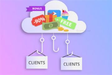
The number of customers you have determines the success of your business, socially in a highly-competitive industry like e-commerce. A […]
Did you launch your online shop years ago and never got to upgrading its design? Are you using one of […]